Hi all,
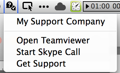
We’ve been talking about it, and it’s just about here: a customizable menu which is designed to keep you in the forefront of your end-users’ attention.

Here is what you need to do:
-
If you have signed up for Custom Branding, please submit an icon designed for the menu bar in both 32x32 and 16x16 pixel sizes.
-
If you have not signed up for Custom Branding, the menu will display the generic bubbles icon shown above.
##FAQs
-
Does the Contact Menu cost extra?
-
No. The Contact Menu is currently available as a standard feature for all subscribers.
-
The menu may be an additional charge for those who subscribe after 31 Dec 2014.
-
Is the menu mandatory?
-
No. The menu’s visibity and contents are defined in the the server’s interface.
-
The options in the menu can be customized at the computer level or the Client Group level.
-
The menu can be disabled at the computer level or the Client Group level.
-
The menu is enabled by default, but can be disabled for your Subscription.
-
What menu items are shown to the end user?
-
The first entry will be your Company Name, as defined in Settings -> Company.
Clicking the first item will open your preferred support method (your email or website). -
Additional menu items are defined by Administrators of any given subscription.
-
What can the menu do?
-
The menu can be configured to trigger
httpandmailtoURLs -
The menu can be triggered to open applications via application URL (such as
vnc://) or Application Identifier (such ascom.teamviewer.TeamViewer) -
If an Application’s Identifier isn’t present on the filesystem, the menu can trigger a URL to download the desired application.
-
How can I get small icons designed for me?
-
Watchman Monitoring is happy to offer suggestions and send proofs. However, we do not offer design services. We suggest you work with a local designer who knows you and your operation.
-
A sample Branding Pack is available for your convenience.
Additional configuration and usage tips will be posted in the coming week.
Please ask any questions below. They will be addressed and/or rolled in to this article.